I have been an active user of the website IBN Live . I still remember the days when I was in the US, the one site I used to open almost daily with this, to catch up on News about India. Just recently the site has undergone an overhaul with a new design. Being a UX critic, I found just so many User Experience flaws here, that I started to vent out my disappointment on Twitter. I do realise that there could have been some business decisions behind this, but in today’s age where good User Experience is the differentiator, it is so easy to lose customers if you have not paid sufficient attention to it.
I do often mention that Making things look Beautiful is not the entire UX. It is a part of UX. User Experience is something larger than simply assessing the Visual Design. It is also about going into the details of Usability, Navigation, Information Architecture, visual design, Content. On many of these fronts, I felt that the design does not do justice to its audience.
Let me highlight just some of the UX issues on this site, that should definitely be improved. (Note: These are in no particular order of highlighted issues)
Visual Design Issues :
Excessive usage of fonts : If you look closely, the website has used so many different fonts. This is problematic, as it distracts the user and does not set the impression in mind that a certain font of a certain type can be used for a certain thing.
There seems to be this overdose of yellow and orange. To the extent that even the sections have yellow backgrounds. The entire Visual Design theme seems so old school now. It would have been worthwhile to check out the latest trends in Visual Design, when going for an overhaul.
Being a B2C website, it is important that the goals of the website are clearly defined. Current there is a lot going on and the result of this is the unsatisfied end user.
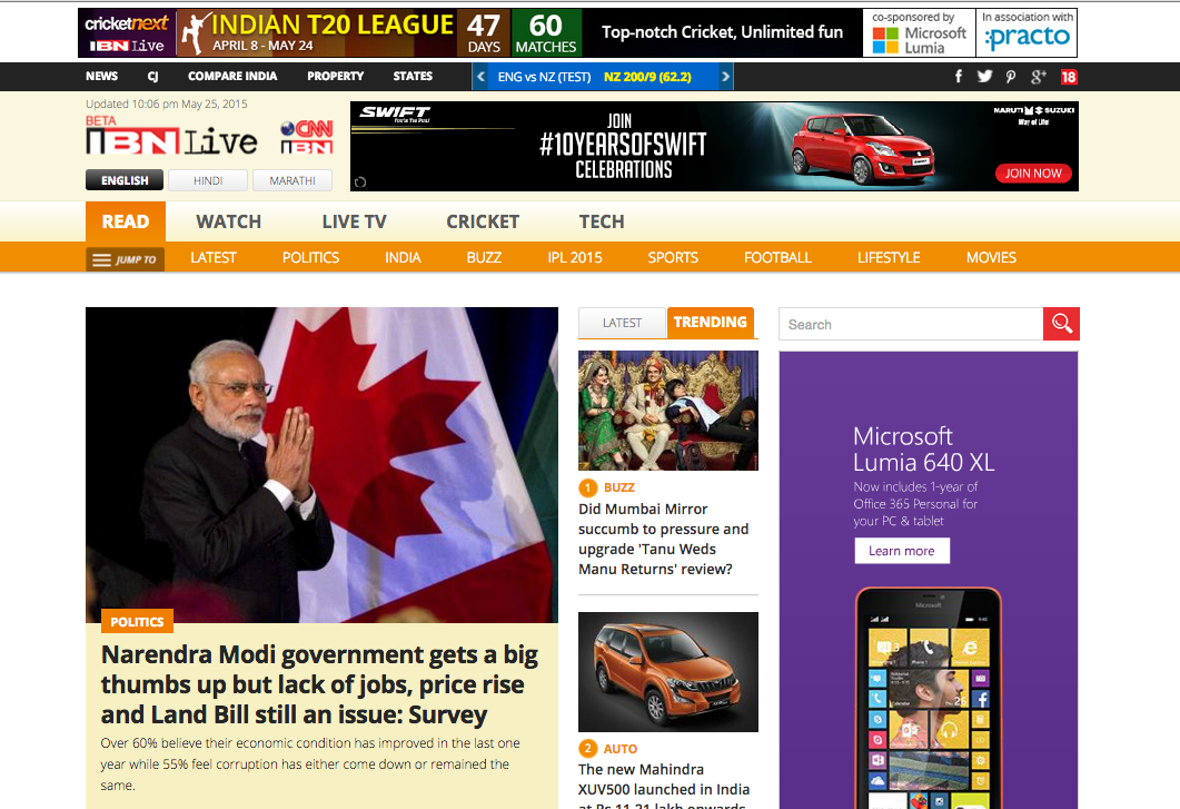
There are sections with numbering, which is kind of difficult to understand.
Floating buttons are not recommended as it tends to break the symmetry in the layouts, and add in lots of extra white spaces.
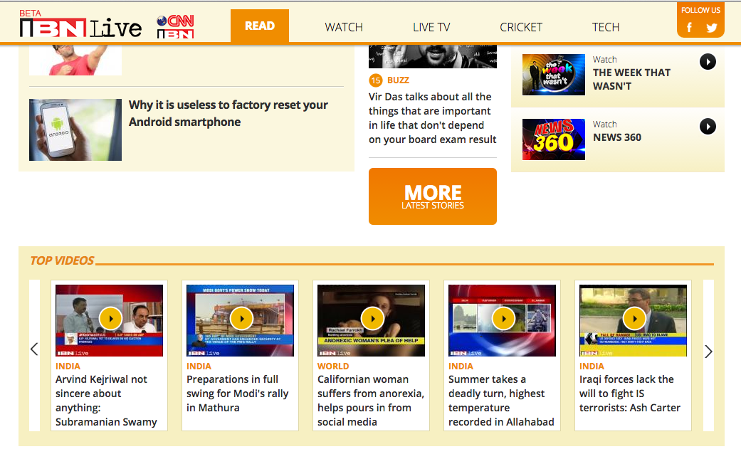
Then if you look at the Top Videos section, the thumbnails highlighted does not seem right. Even the right/left arrow for the scrolling looks weird. It to me looks like a work in progress.
On the good side of things, I do like the way the information is being structured, but I figured it out after some time. Currently the website collates all news related to the popular topic of the day and presents it in one section. Now this is a change in the way information is presented in news sites.