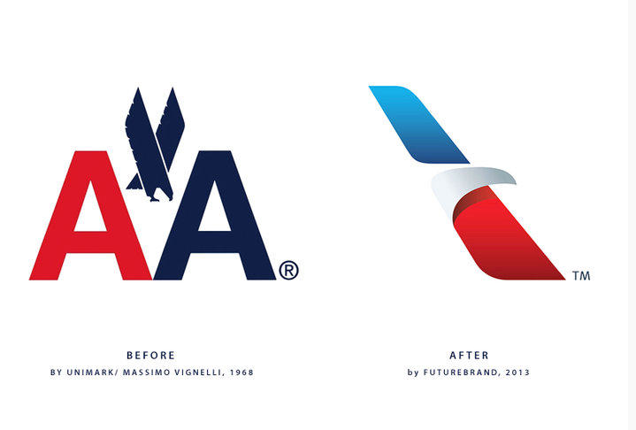
The new American Airlines logo
So the latest news is that American airlines has gone a change in their logo and an overhaul to the branding. The old logo has been in use for around 45 years, and that goes to show its timelessness! A classic in itself, it has stood test in time. So now all eyes would be on the new logo and whether it can do as good. In the times that we live in today, it is easier said than done. Many people these days value Brand experience more than just a visual identity.
A branding redesign exercise is often associated with a change (for the better) customer experience spanning across the passenger services, in flight services, and the processes of doing other things. It would indeed be interesting to see whether this redesign in the Brand creates the value of the corporate overall as well.
One will always be cynical about change. As designers however one is entitled to their subjective opinion, fit to be passed as a judgement. It is a good thing that they released the video, as it is good to know the story and aspirations behind the change.
My opinions on this Redesign?
I am always apprehensive of the redesign of the logos of large corporates. Any high profile company’s change of logo and brand reminds me of the Gap logo redesign fiasco. Because the old logos have been around for so long, it is often challenging for people to accept the new one. Moreover, it is also due to the fact that the level of understanding visual languages amongst the audience these days has gone up. The logos themselves are reproduced and used on many more places than it used to earlier.
I personally think that the logo could have been better.
The logo type looks good on paper or when seen individually, but it is not so good when seen on its actual usage on the planes. You can see it in this video below to make that judgement for yourself.
The new branding also comes with the change on the tail of the aeroplane, in which they have used the stripes in the American colors. The iconic silver colored body of the American Airlines planes have also given way to a grey color. This also becomes a deterrent to the eagle which was a part of the old logo’s legacy, now presented in a more stylish way, being recognized. The eagle is being touted as a symbol of America (see the above mentioned video) , but the new Visual Identity does less to emphasize it. It actually comes off as one trying to camouflage the eagle.
In my opinion the essence of the logo is lost by the strong Visual Identity of two things. One isthe tail of the Aircraft in the American color bands, and then the letters American. The soaring eagle that the design portrays is thus lost in the plethora of things all around it, but most importantly it is lost in the background color of the aircraft.
Having said that, the dynamic eagle does appear to be progressive, and the gradations on the logo makes it look more contemporary. The usage of these however does not make it easily renderable for black and white printing. As a result of which, the impact of the logo is lost considerably when the medium in which it is used changes. A classic logo is reproducible with the same impact across mediums.
Here’s the original designer, Massimo Vignelli of the AA logo talking more on this redesign.
And here is another review by another designer on this.
To conclude, I have a feeling that the AA would now be recognized more by the visual identity of the tail of the aircraft, than the logo.
Hey man, thanks for linking up to my post. Glad you found it useful and worthy of doing so! Take care and have a good one.