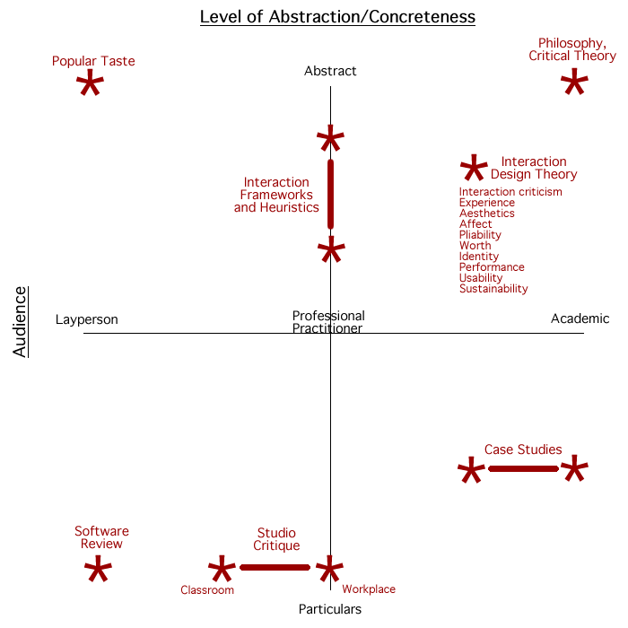
I am a firm believer of the point that designers (and just about anyone in the creative field) needs to be a good critic. They need to critique not only the innumerable work of others but also of oneself. I also insist upon the value of critique and the art of critiquing a lot in my design workshops too. In this respect I would like to share this semantic differential diagram that I had come across during my masters studies.
There are two key things that the designer has to consider, when looking into doing a critique of things.
1. Audience and 2. Content.
1. Audience
The first important thing is the audience. For any critique exercise to take place, understanding the audience is vert important. Once one has an understanding of the audience, they can look to deciding the language and the tone for the critique. In my opinion the language should be kept simple and in easy to understand terms. One can adopt a particular tone depending on the audience. Whether to make it filled with case studies (if the audience is an academic audience) or to make it filled with stories / anecdotes if the audience is more laypersons.
2. Content
This has two parts to it. One is the content you wish to critique on and the other is the content you write in support of the things you wish to critique on. The points to critique on could be the functional aspects, the visual and aesthetic elements of a design. The critic should look to going into the visceral, behavioral and reflective levels of a particular design (D Norman in The Design of Everyday Things) .

Species of Criticism
This above semantic differential outlines the different approaches one could take for criticism. Would love to read more critiques. Do pass on the link if you maintain a blog/website that takes deals with Critiquing and criticism 