One of the classic principles in User Experience is that in no condition you should confuse the user. I am sure every practising User Experience Designer would tell you that in the very first meeting. As a designer one has to ensure that you do not end up giving instructions that are contradictory in nature.
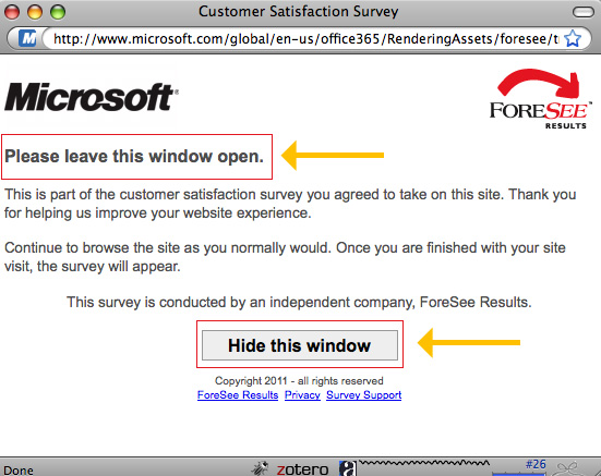
Check out this popup message that I got on a Microsoft site, when I was trying to signup for the Microsoft 360 tool.
Now most users, would not even read the text, and straightaway click on the “Hide this window” button. Yes, I did check it with a few other people around me too. They said they clicked or would click the button without reading the text. After all a button has a higher affordance, and is more likely to be clicked, when it appears on a pop-up (as that’s the thing you are supposed to do)
So an example, like this, you are just reducing the user experience but providing such options. My point, is why would you do that?
I kept clicking on the “Hide this window” and the window refused to hide!
Sometimes, I really think who does the UX at MS. I know a few friends who work there, and I should check with them. Even if the excuse is that it is a survey by a third party, I still believe that there should be a UX quality check, in an organization that is impacting atleast a billion people worldwide!
