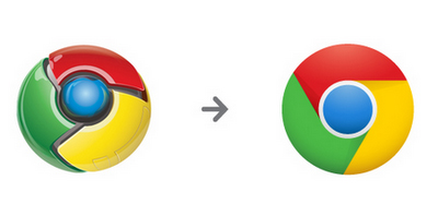
So it seems to be a season of change in branding and shifting to newer logos. We have been seeing a lot of them and Google joins the bandwagon too, with the change in the Google Chrome logo.
I did not like the logo in the first place, for the sheer reason that it was difficult to replicate and was not flexible to be used across different mediums.
On that front I do like the new logo, that it is easy to replicate and reproduce across different mediums.When you are thinking of a
I like it for its simplicity, but find it lacking in personality. It does not do justice to the brand that we have come to think of Google as.
So I as such, have mixed opinions on the logo. I do appreciate the fact that there is this effort on making all logos of all it’s products using the same set of colors, so that it represents as a part of the whole Google family.
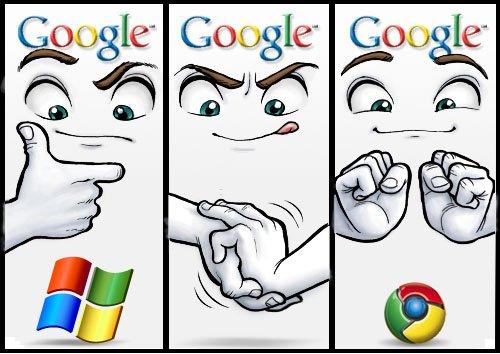
Reminds me of this earlier comic strip that was in the social media when the first version of Chrome was launched.
Would be really interesting to know about the design thought process behind the logo. Wonder if its available anywhere as a case study.


