After reading an article by Hebdige on Subculture and Style, today, I tried to go into the cultures and subcultures that exist within the frame of Interaction Design. I was surprised how the thing that first sprang up was the culture of Web Design. And inside the culture of Web Design, we had (or still have) the subculture of Flash Websites.
When I dug more into this topic I found that it is really interesting to analyze from the days of the flashy banners (one subculture) , to the days of Web 2.0 (another subculture)
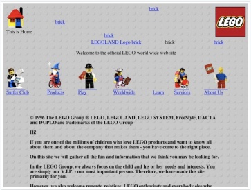
Initially the websites were full with texts, monotonous and boring content. In order to break away from this monotonicity, it was followed by the usage of lots of pictures and providing more and more links in order to make it more interactive for the user.
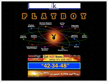
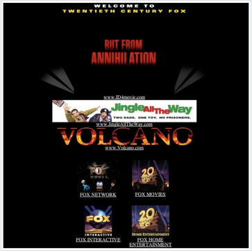
However in the gamut of links available for the user who often got confused, the notion of using flashing texts, and blinking images were introduced. This led to a surge in the number of websites trying to do it. And yes, what better way to gather attention then have a extremely harsh color like pink, orange, bright greens on a black background. Visual ergonomics took a back seat. It was all about garnering attention. Anything that helped in doing so, was in fashion. So many sites had extra borderings around content, in bright colors to lay emphasis. Clip arts were used to add to the texts to make it look more stylish. I am sure one can look at the prime background colors of the websites during this period and see that it was black.
This was similar to the punk subculture where the appearance itself was enough to get attention. Since what was accepted in the internet world was not clear and User Experience was unheard of, it was ok to have anything that “looked” attractive.
In around mid 90s , comes Macromedia Flash, and the whole notion of interactivity changes.But even within this there was still a group who saw Flash not as a means to increase interactivity, but to add more flashy and attention gathering content. Till this time animated gifs were in full swing. They were dancing, sliding, and scrolling their way across the eyes of web surfers trying to read the texts on the page. And for many Flash was merely an easier tool to produce this kind of “eye-catching-graphics”.
What Flash also did was that it set divisions within the society as to who built sites using what. It also became a status symbol to have a website built in Flash. The connotations being that it looked cool and contemporary. People who built websites using flash (the senders) were considered to be extra talented and hence looked high upon. So photographers, artists, musicians, and other “creative” people (the addressers) looked up to them having a Flash website and the more reliable, faster loading and content heavy sites made on plain HTML was left to the academia mostly. HTML sites became more of the intellectual, and the high funda stuff, whereas Flashy websites denoted a person who was more creative and was involved in the disciplines like the arts.
The above argument has evolved over the years. The use of Flash has proliferated well and crossed boundaries. Similarly with the advancements in the web development and other interactive options like PHP etc, this subculture may not exist anymore. And even if it does, it is probably limited to the amateur content.
What has evolved into web 2.0, could very well be considered a subculture these days. After all what was fashionable a few years ago like to have a Flash website, is now having a Web 2.0 website. I often wonder how many actually know what the meanings behind either of them were / are .
What I am trying to get into is that with constantly evolving paradigms in web design and User experience on the web, it is really interesting and I think worthwhile to study these various subcultures that have been established within the community.


