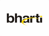
I think that understanding of the sender / recipient , addresser/ addressee is really important as a designer. Just like we discussed in one of our class with the case of the User Research, I think that using this understanding is really important while doing brand identity and logo design. Here is a case of Bharti , one of India’s industrial powerhouse. The context being discussed here is the company changing their logo recently.

Old Logo
So when a company goes in for a change in their brand identity, in most cases they they get it done by a different design company (or individual at times). So we have a change in the sender. For the designer doing the design, the recipient of the design is the client. But the final addresser perhaps would be the entire company and the addressee the audience to which the design is presented (the you and me). Thus one can see how they are all different in this case.

New Logo
The sender (the actual person) here would be the person who designed the logo in the design team (which one is not sure, as many times groups in India have it done by non-designers), the actual addresser in this case is the company, Bharti (group of companies rather). This is not the same as , the founder / owner of the company speaking through the design. It’s a non human that we are being spoken by. In this case one does not even think that its Sunil Mittal the CMD, who is speaking to the addressee.
When the client (addresser) has a vision , then does it hold the same for the designer (sender) as well? While designing a logo for a company with any own vision, a designer’s vision requires to understand this, in a short span of time. This also has to be informed by the existing situations within the company and also the company profile in the real world. The designer (sender) also has to understand the recipient (the contact person in the client’s side) and also the addressees (the company and the final audience who view the design).
When trying to understand the semiotics behind the logos, one can see that the referential function (the content) has not changed much. In terms of the content, it is still composed of the two texts. However as signifiers, the two forms signify two completely different things.
The old one signifies stability, a company that is firm in its intentions and is built on a strong foundation. Hence the usage of the bold black fonts to make the logo. It is all about the establishing the company’s presence, by the addresser; till this point. The dynamic nature of the company that is still expanding in new horizons, but has its focus on establishing itself first, it signified by the yellow curve that allows itself to blend into the addresser’s intentions.
The new one signifies the a modern, new, dynamic approach that the company is adopting. The interplay of the formal content (form) in terms of a bold and the curved forms within the individual letters is interesting. It did exist in the previous form also, but it is very prominent in the new logo. It is a signifier of the company looking into different, and newer opportunities. From the company’s press releases it is understood that they are now looking into a stronger presence in rural areas of the country. This representation using the curved with the bold vertical strokes (which are really contrasting elements to each other) in the new logo, signifies the rather risky task that the company vision’s itself into. With their presence they seek out to bridge out the gap between the rich and the poor, the urban and the rural India. This; for any company is a highly risky business. But Bharti with it’s new dynamic logo wants to put it out in the open for the addressees. The addresser’s intention here is to make it clear of what they want.
The metalingual function that would be provided here is different than what held true for the previous one. Based on the understanding of expressive typography and basic color theory, one would interpret the two logos in a different way. The new one oozes with confidence and with dynamism. It is futuristic and also looking with hope into the future. This is also stressed upon by the yellow triangle. The use of two triangles and one out of its boundaries, signifies the company’s intention of expanding into the unknown territories. This same element in the initial logo was in the form of a yellow square that rested on the company’s initial policies. With the company’s vision changing, the subtle change in the orientation signifies exactly what the addresser wants the addresee to understand.
The redesign in my opinion is a sincere attempt to put into; a simple yet highly valuable form, the company’s vision that it has; setting into the next few years. The re-design of the Bharti logo, should be understood in this semiotic approach to get a better understanding of the company’s history, its current situation and its brand value that has been built. It is only then that one would get out of the superficial criticisms based on one’s personal judgment which are often I like it and I don’t like it.
[…] the Aadhar Logo Posted by kshitiz on May 02, 2010 Graphic Design, articles, critique, design In one of my earlier posts, I had written about analyzing logos by using Semiotic Theory. What it basically was to take a […]